


This case study includes:
Self-Publishing, Illustration, Branding, Custom Logo Binding Layout & Strategy
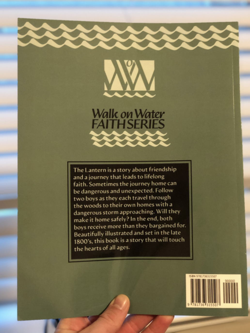
Walk on Water Faith Series
The Walk on Water Faith Series is an ongoing collection of Children’s books by author Robin Stephens. The WoW branding is critical not only because it identifies this series but is also the choice of distinctive gestures of Mrs. Stephens’ acumen as a professional author. We kept this in mind from the beginning, and this strategy has influenced the creative direction of both The Lantern and The Rock Man, and will suit other books she’ll write in the future.
In this section, you’ll see my process through the concept phase of not only the illustrative direction but also navigating the branding of this series. After the concepts are high-res proofs of the finished pages, and then I wrap up with photos of the books in the real world, and with my satisfied client.
Please note that images may take some time to load since they’re pretty high resolution.
Concept process
My journey in articulating the visual narrative of both The Lantern and The Rock Man begins with an overcompensation of prerequisite material, including both concepts, storyboard layouts, and practice drawings. Frankly, this is the nature of my process with any project. As Nassim Taleb puts it, you have to overcompensate on your options and then hedge with great wisdom in order to come out antifragile, improved by randomness.
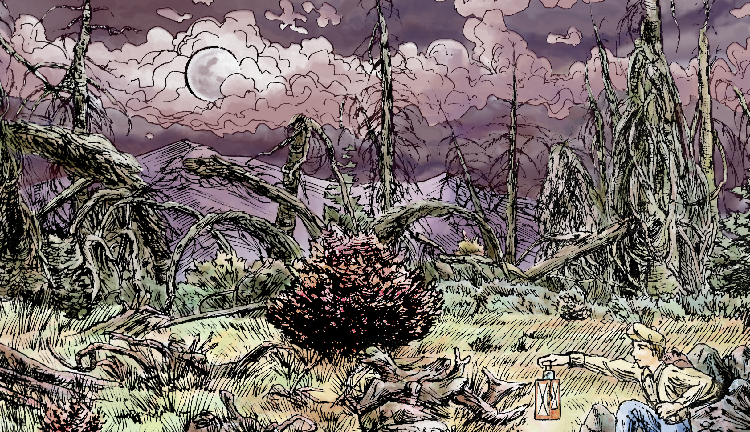
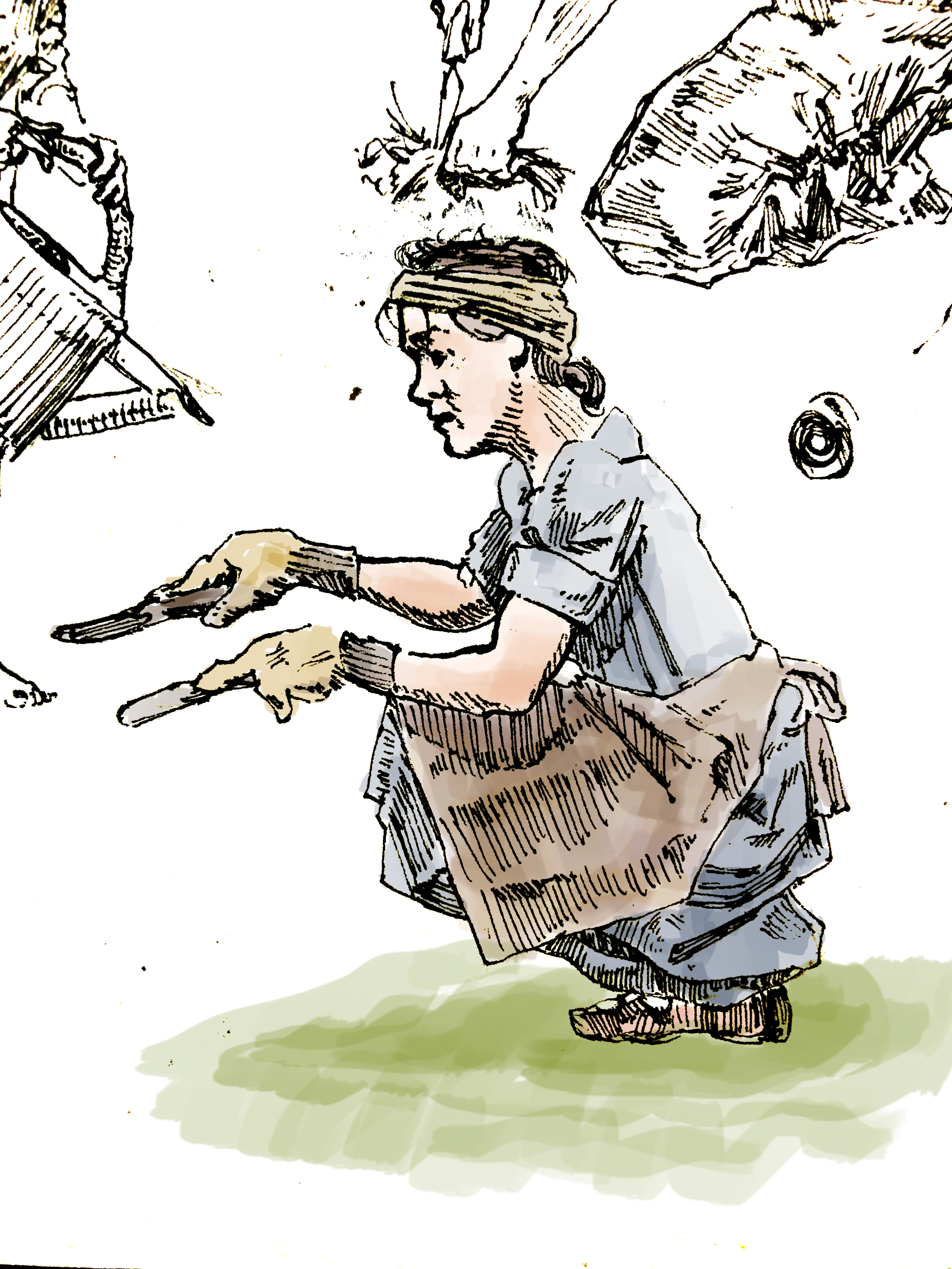
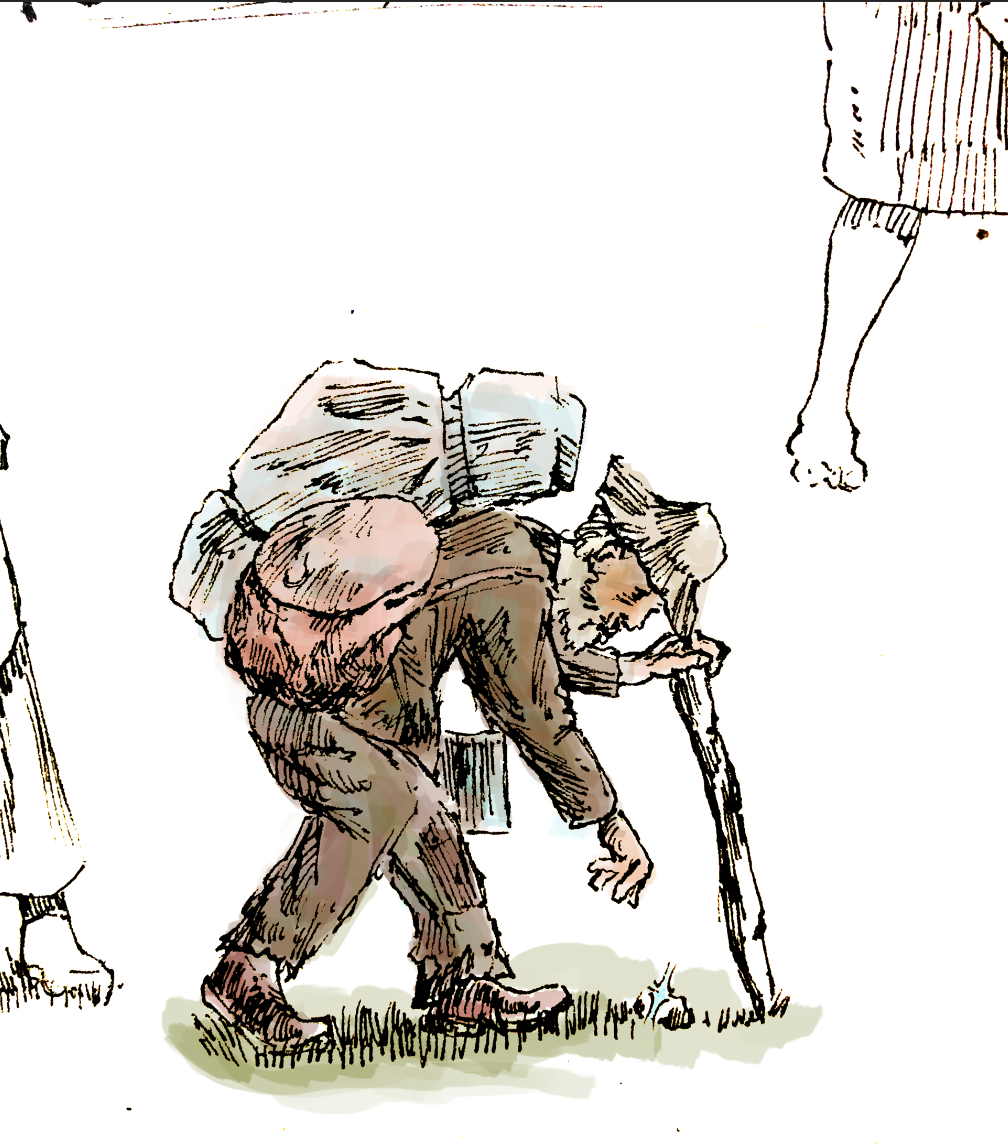
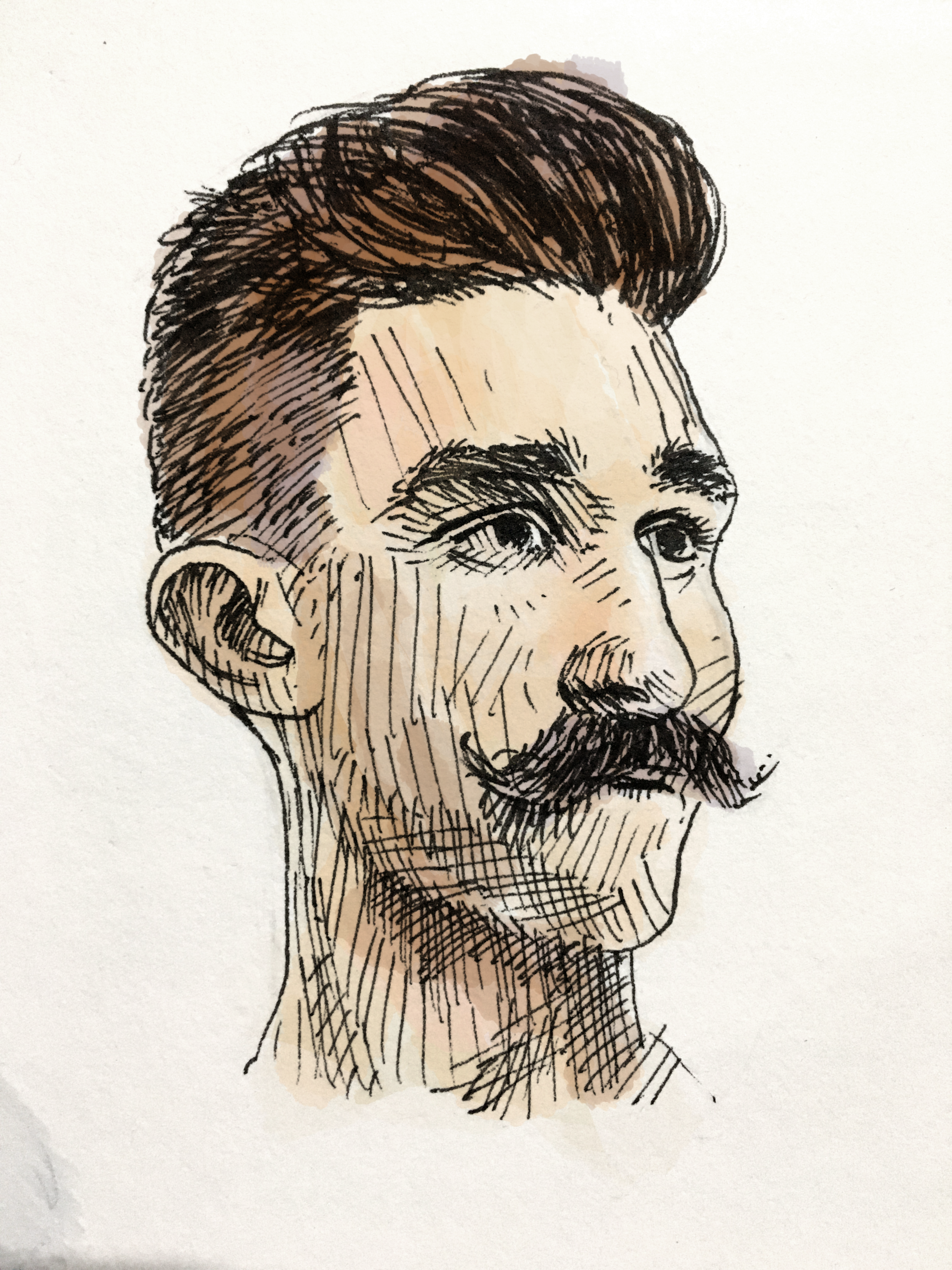
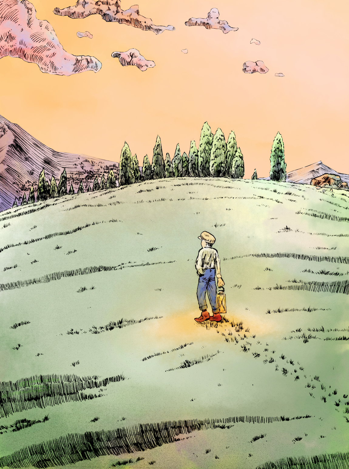
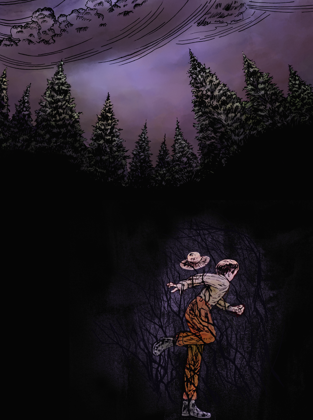
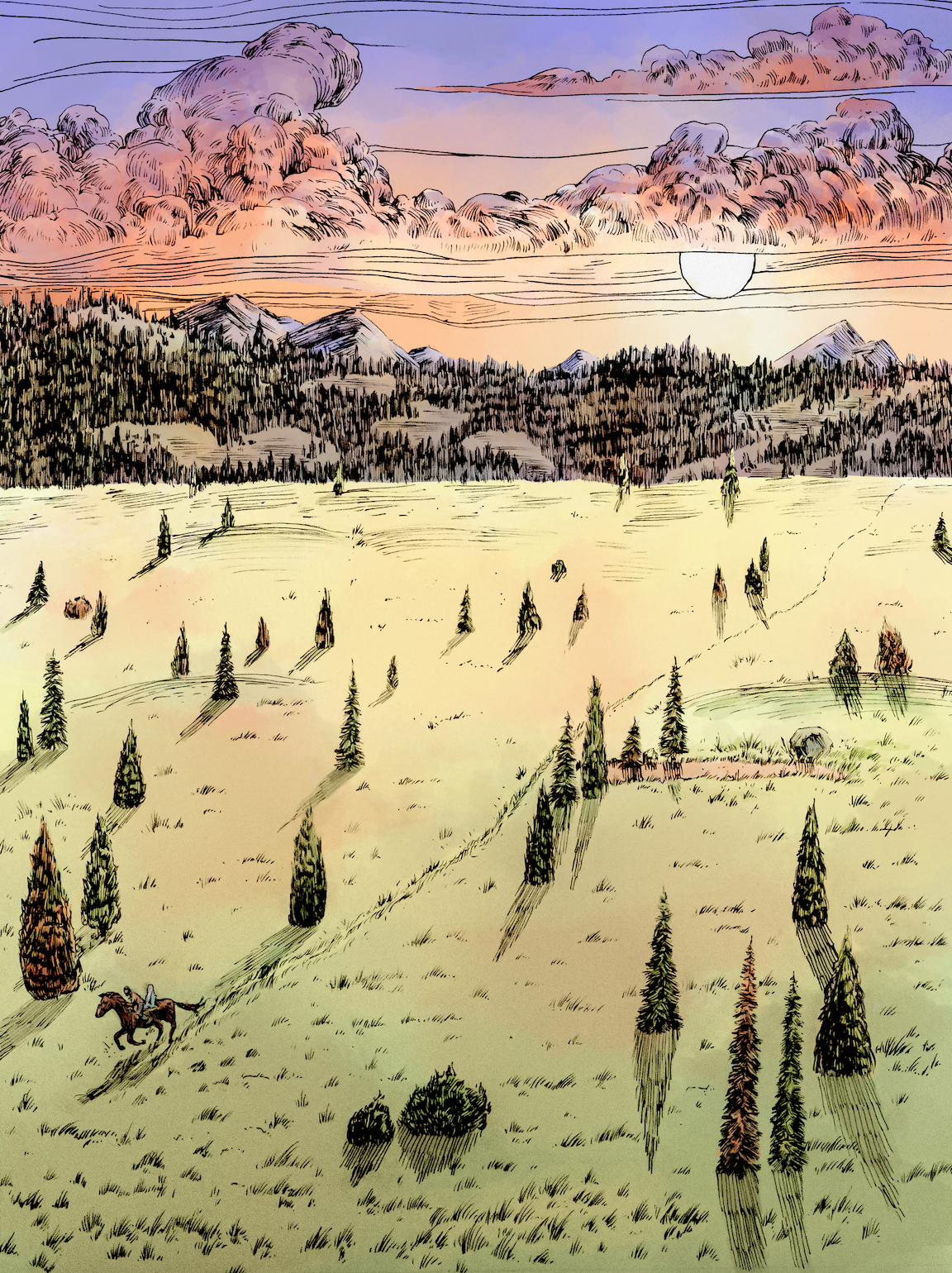
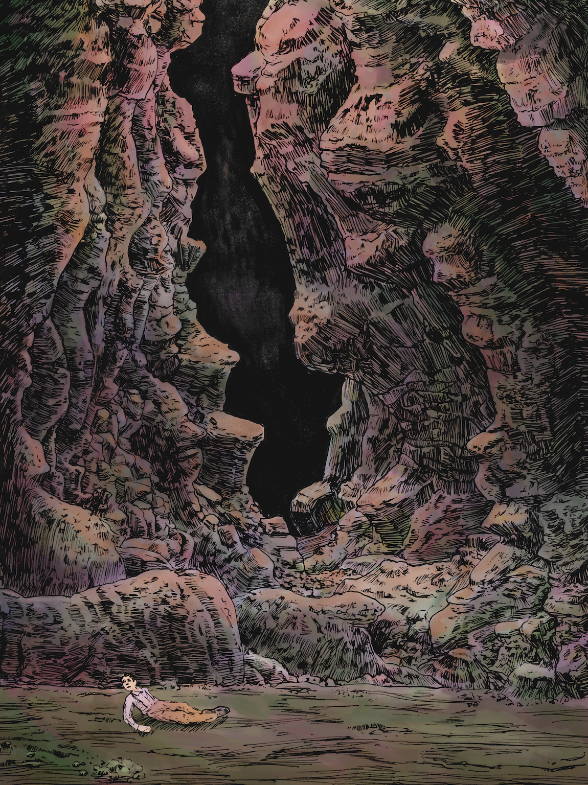
For The Lantern, because this was my first project with the author, I took the measure of coloring most of my concepts and storyboards in order to get the right feel for the story. This narrative is a bit more harrowing, so it called for a more gritty feel. The author saw it wise to give the story a consequential lesson, despite our age range seeing appropriate her stories for youngin’s age 4-5. She feels strongly convicted that many stories (including those she’s had to tell in the classroom) expend too much sheltering as to giving the illusion that there are no really consequences to actions. Though we seriously need to protect and provide for our youth, we’re doing them harm by setting up false expectations.
So, it was important that the illustration technique depict that. Simple pen hatching & drafting had been my primary method in drawing, and I had spent the previous year practicing gesture drawing, emulating objects and landscapes, so I believed I was up to the task. After the author lent me samples of her favorite children’s writers/illustrators, and after careful evaluation, I went ahead and made my plethora of ‘practice shots’.
Most of the illustrators she referenced were vintage classics, who also draw with a pen like I prefer to. It wasn’t an unfamiliar task for me to get into that headspace. I have sketchbooks full of this kind of work!
Getting the coloring right was critical to getting the desired effect. Though tedious, it wasn’t long until I figured out the right kinds of brushes and calligraphic settings to emulate a kind of watercolor/gouache look.
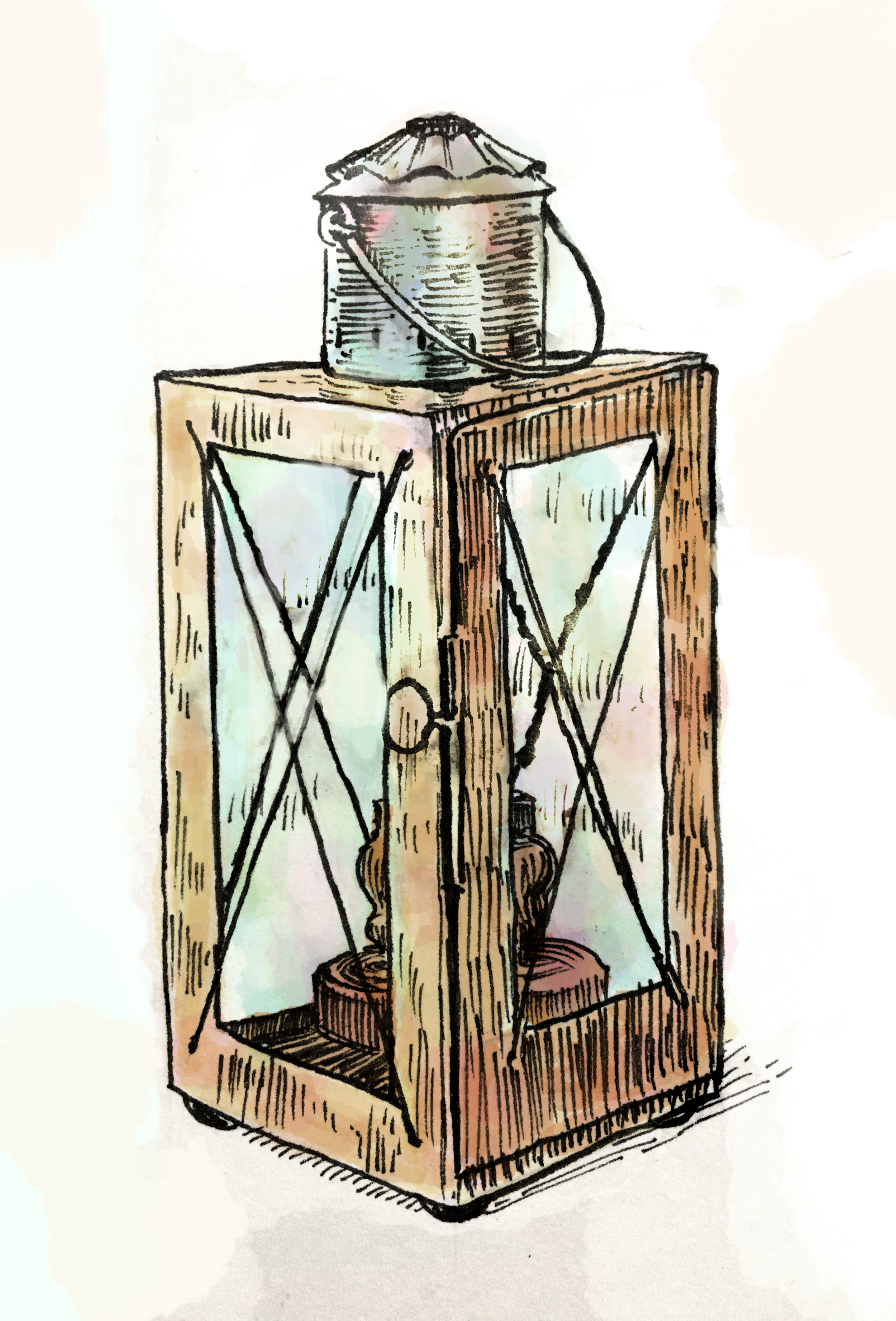
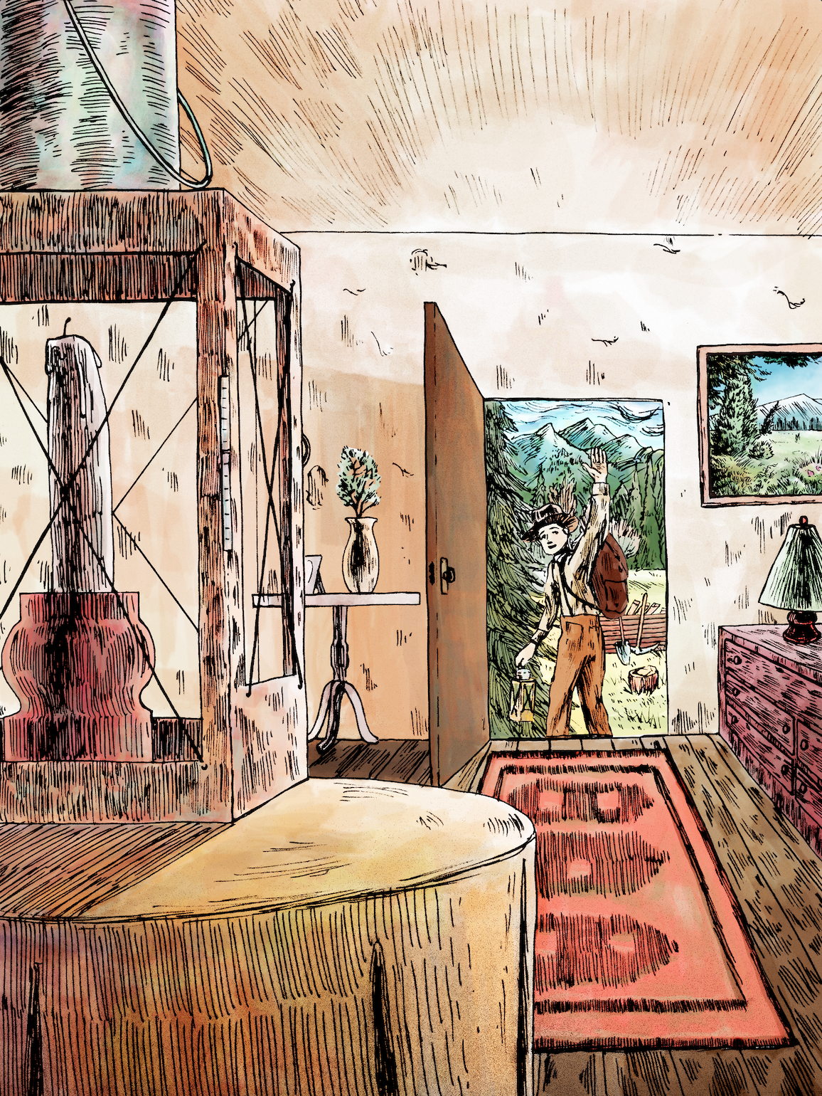
I was particularly fond with a color experiment I did with one of my concepts for the lantern object, and it stuck!
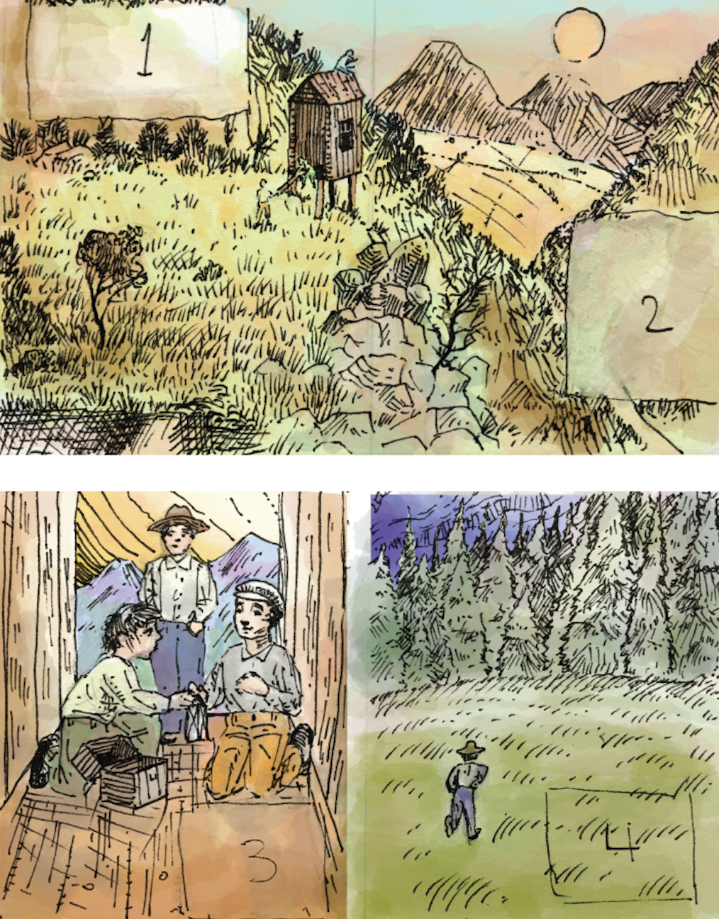
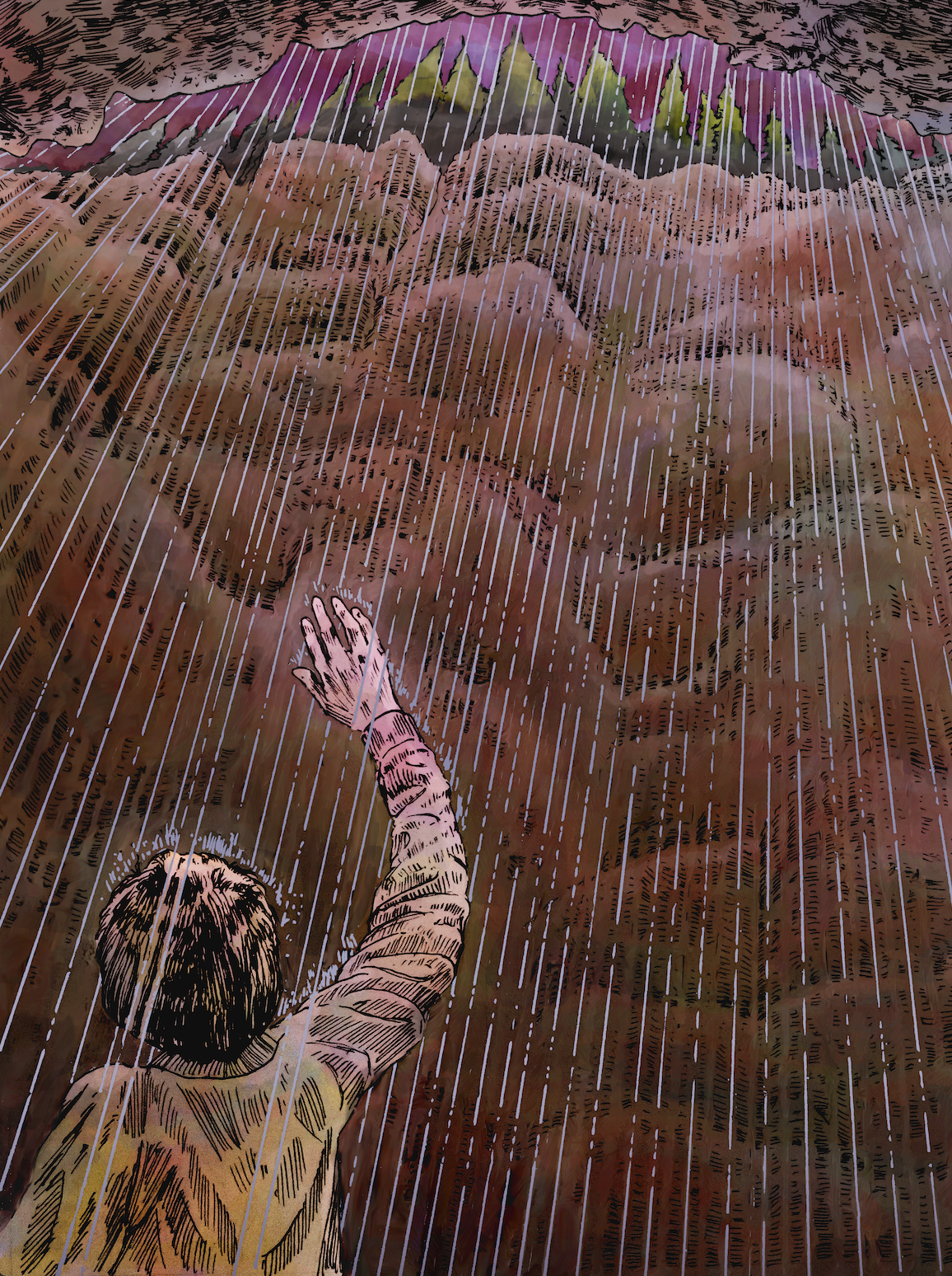
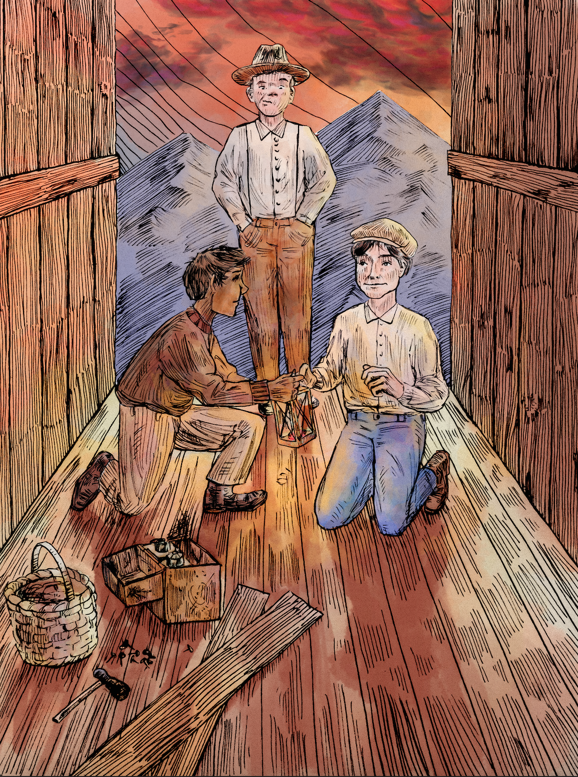
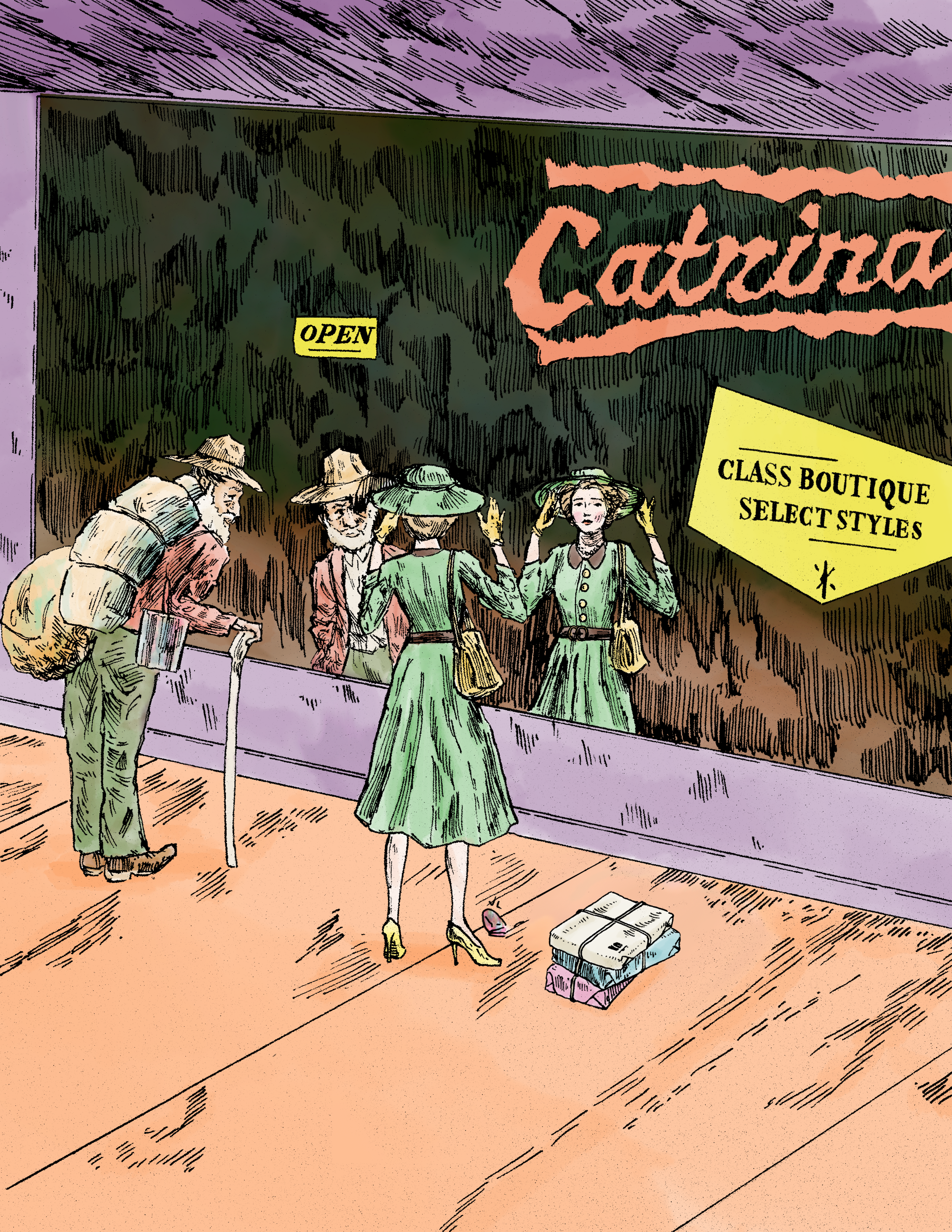
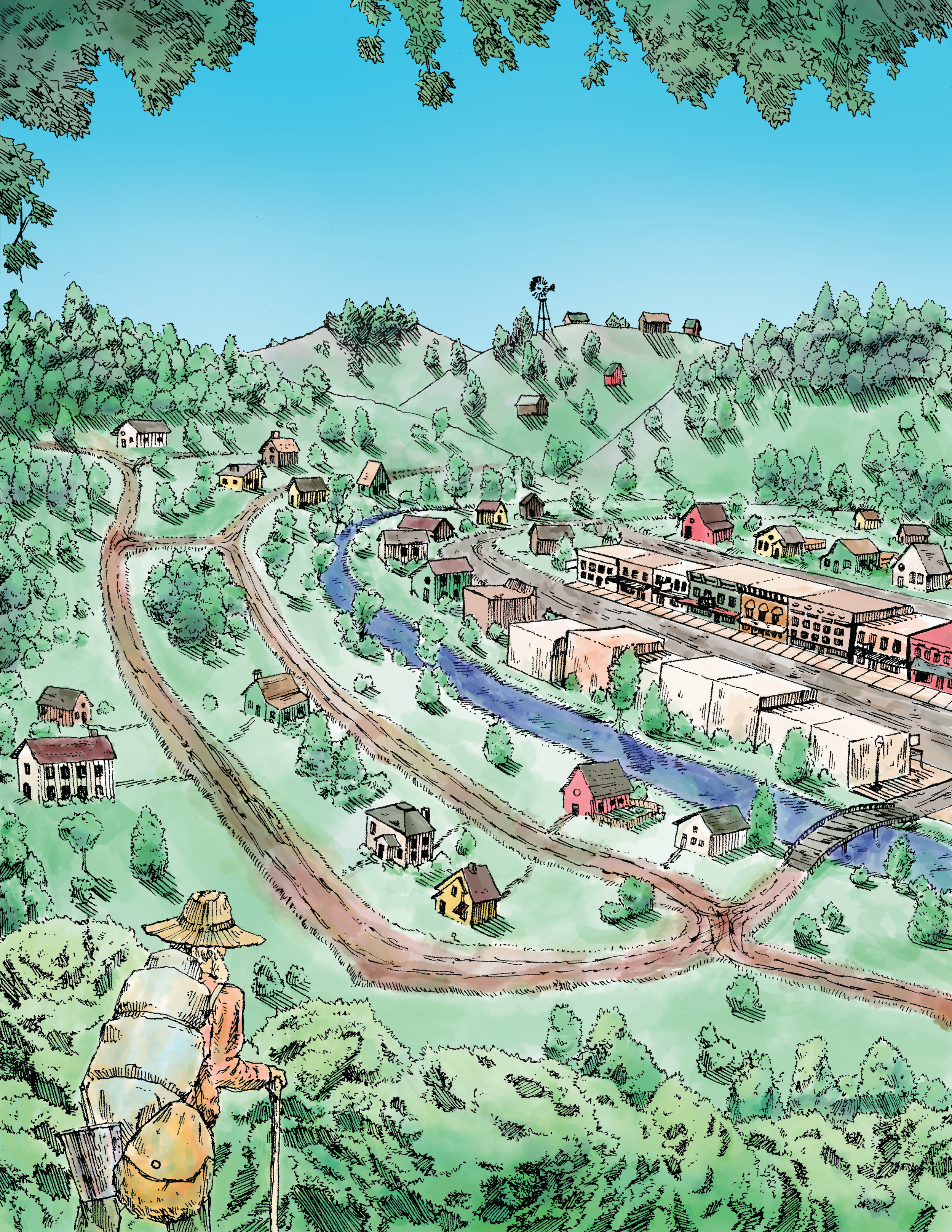
Storyboard design is both a technical and very imaginative process, because your aim is to affix the reader into a frame within the environmental headspace that the subtext suggests. Many angles are tried to depict the scene in the most appropriate manner to not only the story but the author’s literary ethos/technique. If that can be done, you have the essence of a truly dynamic story.
(Below are the concepts & storyboards for both The Rock Man and The Lantern.)


Branding/Binding Strategy
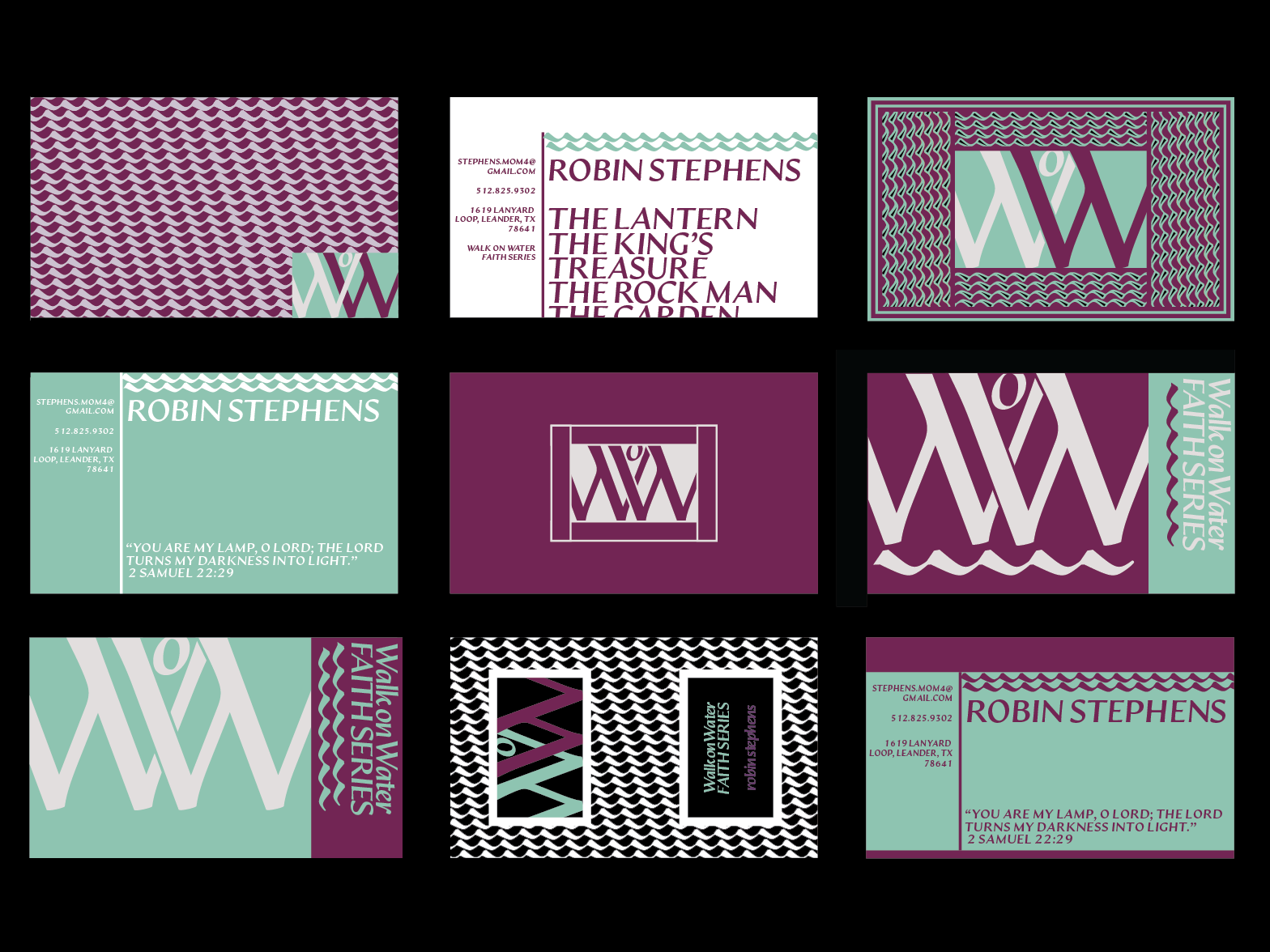
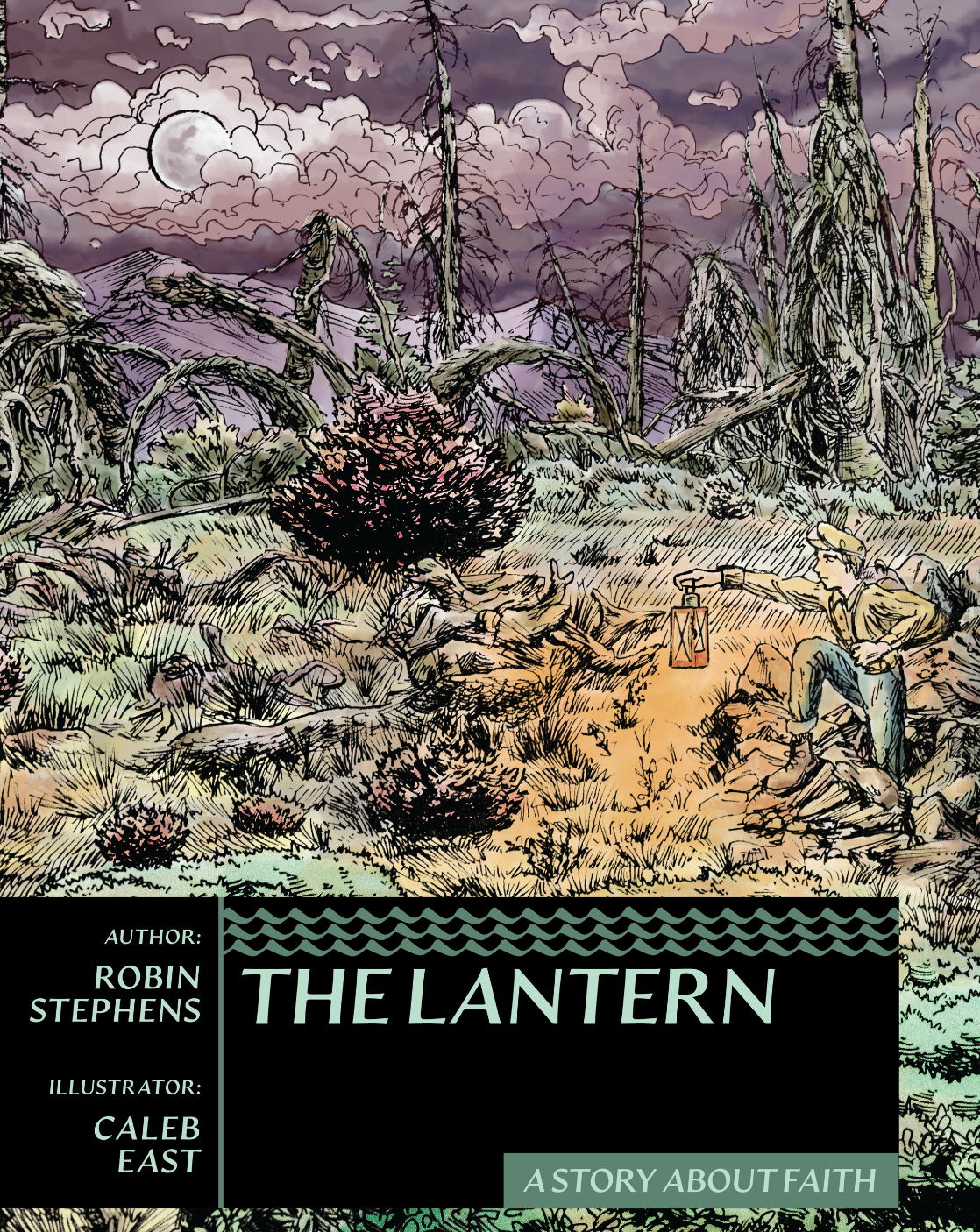
When it came time to put her book together, I knew that its total design & layout had the potential to construe a common identity system for her series and authorship, WoW, or Walk on Water Faith Series. Because, as mentioned earlier, her stories intend to avoid the consequence-less-ness of postmodern writing, we sought to design her branding as more mature. I was thinking Penguin Books, Pelican, or Great Illustrated Classics (from which I read many Jules Verne novels way back when). Largely, I invoked the friendly print-modernism of the mid-century period with type referential to formal writing traditions to signify her brand story.
The type family, Artifex, is consistent through every touch point in the WoW catalogue. This typeface was chosen for its readability but also its etymological character. It gives a heritage quality to the tradition of storytelling literature by use of its distinct invocation of the use of a calligraphic tool by a lettering master. The designer of this beautiful font, Connary Fagen, is a contemporary designer and created Artifex in 2020. I specifically sought out an erudite typeface of our day to harmonize with the passion and erudition of the author.
One change-up we had to make from The Lantern to The Rock Man was taking the narrative text blocks out of the illustrated pages and onto their own. The Rock Man had much more writing to be integrated, so we decided to pivot to this left-illustration, right-text page layout. However, a thematic bit remained from the previous book, which was that on the pages which we decided only to have text because there was too much writing, I placed a story-characteristic illustration below. This would serve to make the experience of reading the Walk on Water Faith Series a recognizable and unique one.
The Navigation Station is a section at the end of each of the WoW books which is meant to be a guide for the parent to dig into faith concepts in the book. The Author asked for a symbol to specify the section (as seen in the top right corner of the Navigation Station [right]). I also thought to include the wave-pattern to subtly tie in the series’ branding. I was important to keep this section formal since it seeks to help not only the child, but also the parent elucidate the gospel. Therefore, the tones were left black and white.
(Below are images of the design work integral to the Walk on Water Faith Series, and after are hi-res highlight copies of pages from The Lantern, and then I finish this case study off with the highlights from The Rock Man.)
![Portfolio 2022 [Recovered] 2-15.png](https://images.squarespace-cdn.com/content/v1/62226cfd7fdfbd3c60e45546/b5a126b8-9449-45ee-b4f1-070b2836571b/Portfolio+2022+%5BRecovered%5D+2-15.png)
![Portfolio 2022 [Recovered] 2-09.png](https://images.squarespace-cdn.com/content/v1/62226cfd7fdfbd3c60e45546/4833154b-eaff-4820-a772-c474494480bd/Portfolio+2022+%5BRecovered%5D+2-09.png)
![Portfolio 2022 [Recovered] 6-32.png](https://images.squarespace-cdn.com/content/v1/62226cfd7fdfbd3c60e45546/668c564c-10a1-4579-9bce-d16be996d3d2/Portfolio+2022+%5BRecovered%5D+6-32.png)


The Lantern: A Story About Faith

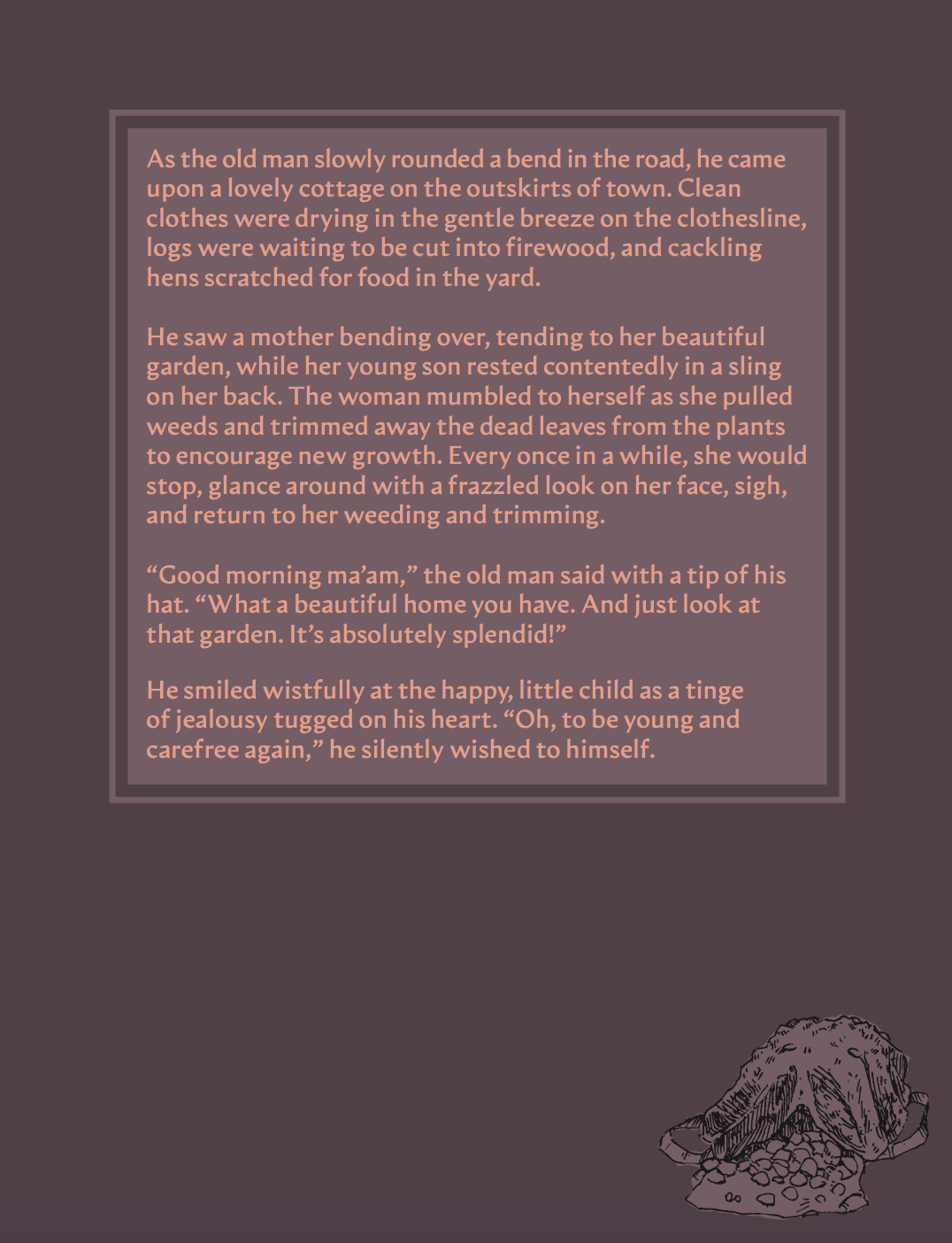
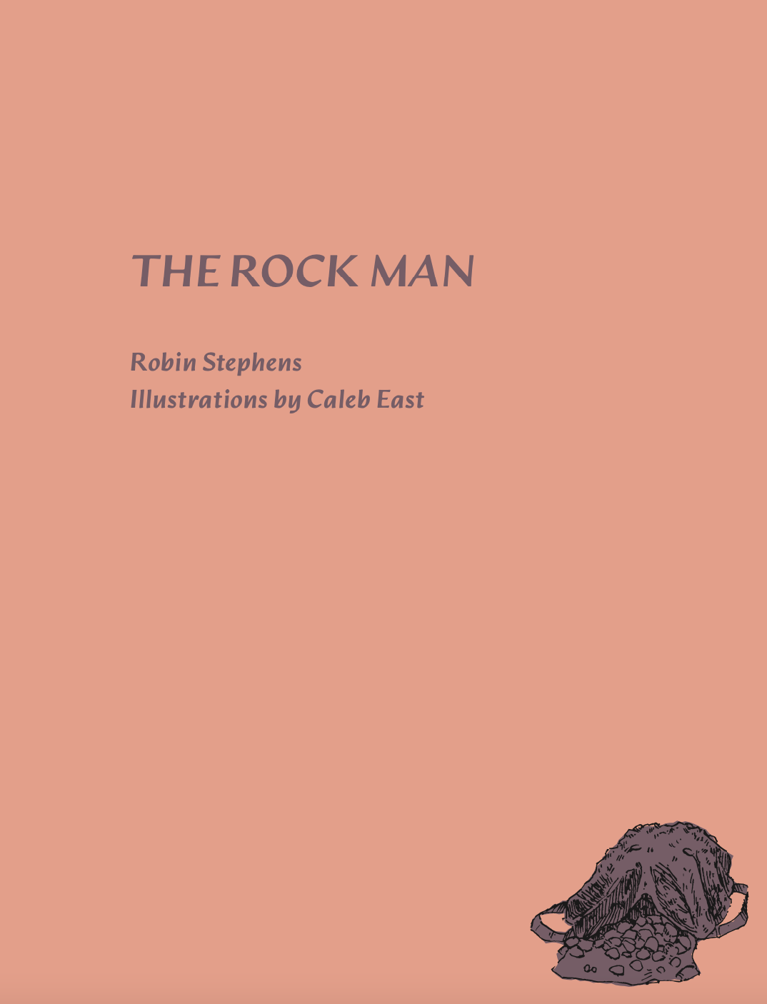
The Rock Man: A Story About Wordliness


Story isn’t just communicated through literature.
Story also plays out in business. Everyone is at some point in their own decision journey regarding their relationship to a product, service, organization, etc. Let’s design every point of your customers decision journey to their advantage—to aid and encourage them in their process, and yours.