This case study includes:
Motion Graphics, Church Communication, Brand Collateral, Image-Making & Volunteer Work
Northway Bible Church
The reader may note that the church issued a name change in early 2023, changing from Hill Country Bible Church Leander to Northway Bible Church.
Early on in my later attenence of the church, being unavailable to serve Sunday mornings or evenings with my church, I was offered to use my design skill-set to solve many graphic problems, including Sermon slide designs, website thumbnails, pre-service motion reels, logo animation bumpers for video projects, and anything else that they ask for help with.
Having spent the past year doing image-making to create sample collateral to market my typefaces, I felt equipped to handle similar projects. I had picked up motion design at the start of 2022 after I felt I could use better know-how in the field of church media, having created sermon and worship communications for our college bible study winter retreat. I was surprised at how fast After Effects could be learned.
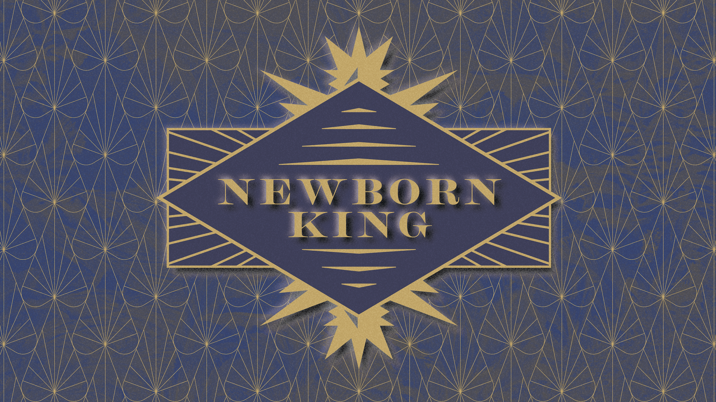


Above: Newborn King Christmas sermon series
The first slide is the graphic we decided to approve for the series.
As 2022 was wrapping up, the sermon planning team commissioned an identity for our Christmas season.
They asked me to play with art deco styling, and a kind of wondrous Christmas atmosphere.


Above: Abide sermon series concepts
The final slide is the graphic we decided to approve for the series.
Spring had come in 2022, and our sermon planning team saw a fitting opportunity to preach on what it means to grow in knowledge of God, as does fruit on the vine—being that Christ said “I am the Vine.”
We decided to appropriate an illustration in the style of new wave-era painter Hiroshi Nagai, who crafted the most peaceful spaces with clean lines, shapes, and pop color tones.
Many layout options were explored, and we inevitable decided to warp the colors of the painting to accommodate the title.


Above: Family Circle sermon series concepts
The final slide is the graphic we decided to approve for the series (though it is pretty badly cropped, I did not get a copy of the final file). Another volunteer designer completed the work based on the concepts I sent.
Spring had come in 2022, and our sermon planning team saw a fitting opportunity to preach on what it means to grow in knowledge of God, as does fruit on the vine—being that Christ said “I am the Vine.”
We decided to appropriate an illustration in the style of new wave-era painter Hiroshi Nagai, who crafted the most peaceful spaces with clean lines, shapes, and pop color tones.
Many layout options were explored, and we inevitable decided to warp the colors of the painting to accommodate the title.
I created three motion loops for worship lyric backgrounds out of the blur and prisms of the main graphic:


Dare you to move
That’s top-tier motion design humor. Now, how does a logo’s meaning change when it becomes animated?
If a brand’s visual strategy solidifies its archetypal posture, then animating those visual elements is what affirms its gestural dynamic as a relevant, moving pattern within our sphere of living.


The pre-service info-motion reel
These are all part of one info-reel that plays before service starts. The motions had to be passive and cool, while still legible an clear enough for anyone in among the congregation looking to fill in their info gaps. I was pleased at the Creative Arts Pastors’ idea to have a section just for displaying our churches vision statement. I’ve attached a video file for my motion-portfolio.
They were a nice bit of novelty to curious guests and long time members alike on that crisp opening Sunday morning.
Logo animation process
The logo animation story is pretty goofy! It’s an example of the randomness of erudite trial-and-error lending fortune. First of all, it was totally unsolicited. So after a few practice runs learning motion techniques on After Effects, I was extra-eager to try animating a logo. I created a clunky interpretation of the HCBCL logo, weaving itself into creation. I gave it an intense blur to make it look like a light saber (our senior pastor is a Star Wars fan), and did a motion for our title, only instead of Hill Country, I typed our youth pastors name. Then shared it with our senior pastor and creative arts pastor. Surprisingly, they asked me if they could use it as a bumper for a video project in the works.
So, I cracked my knuckles and got to work refining the shapes and easing of the animation. Slowly, I worked out the fine-tuning that is necessary for giving life to a beautiful mark as such. Once I was satisfied, I animated the title. It’s persona had to be on par with the logo—striking & bold, yet simple. What I’ve really enjoyed about this identity (which was implemented in 2020) is that it fits with the doctrinal essence of our church while also subtly invoking church history. The mark feels celtic in form, it’s woven like some medieval symbol. The typeface, Futura, while being an obviously modern staple, actually has a historic signification with the proportion of its design. Pair it with a roman face like Trajan, and you’ll see how Futura is actually not so ignorant to ancient tradition. It’s a whimsical thought for a Reformer who’s fond of theological retrieval.
Marshall McLuhan had a lot to say about media. I’m sure his analysis of graphics put into motion as such would have caused him to say something along the lines of the animation reversing the order of the media that was previously static and fixed into a kind of archetype.
-
![]()
Concept 1
I knew this first concept would have been a tough sell—too many seemingly haunting blur effects. It did however make for a characteristically poised mythic image, which was the direction I went in. The title is juxtaposed on some fine tag or token. This one I may prefer to consider part of my ideation process.
-
![]()
Concept 2
This one issues a lot of grain to give off a very mythic kind of effect. Like an expressionist stippled or dabbed painting, the subjects show through the image, not upon it. Therefore, they show through the ground, making the ground the focal point of the work. It begins with effect rather than cause, which is integral to our relationship to religion.
The title is juxtaposed to invoke a stained glass frame, which also demonstrates ground centrality or reciprocity. This concept was revoked for its use of our name, which was unnecessary.
-
![]()
Concept 4
Here I experimented with an embossed and textured effect. It was a fitting idea for the title as the nature of the invitation is deeply immaculate and profound.
-
![]()
Concept 3
These white ones turned out to be my favorite. Unfortunately, just days before opening Sunday came, it was recommended that we not go with these ‘postcard‘ images because the white was too blinding!
-
![]()
Series title options
The committee requested a slide just for the word mark options, so I gave them my best ones. We didn’t shy away from considering Futura, which would have been appropriate to demonstrate our brand essence to new visitors (since it is our visual identity system’s primary typeface).


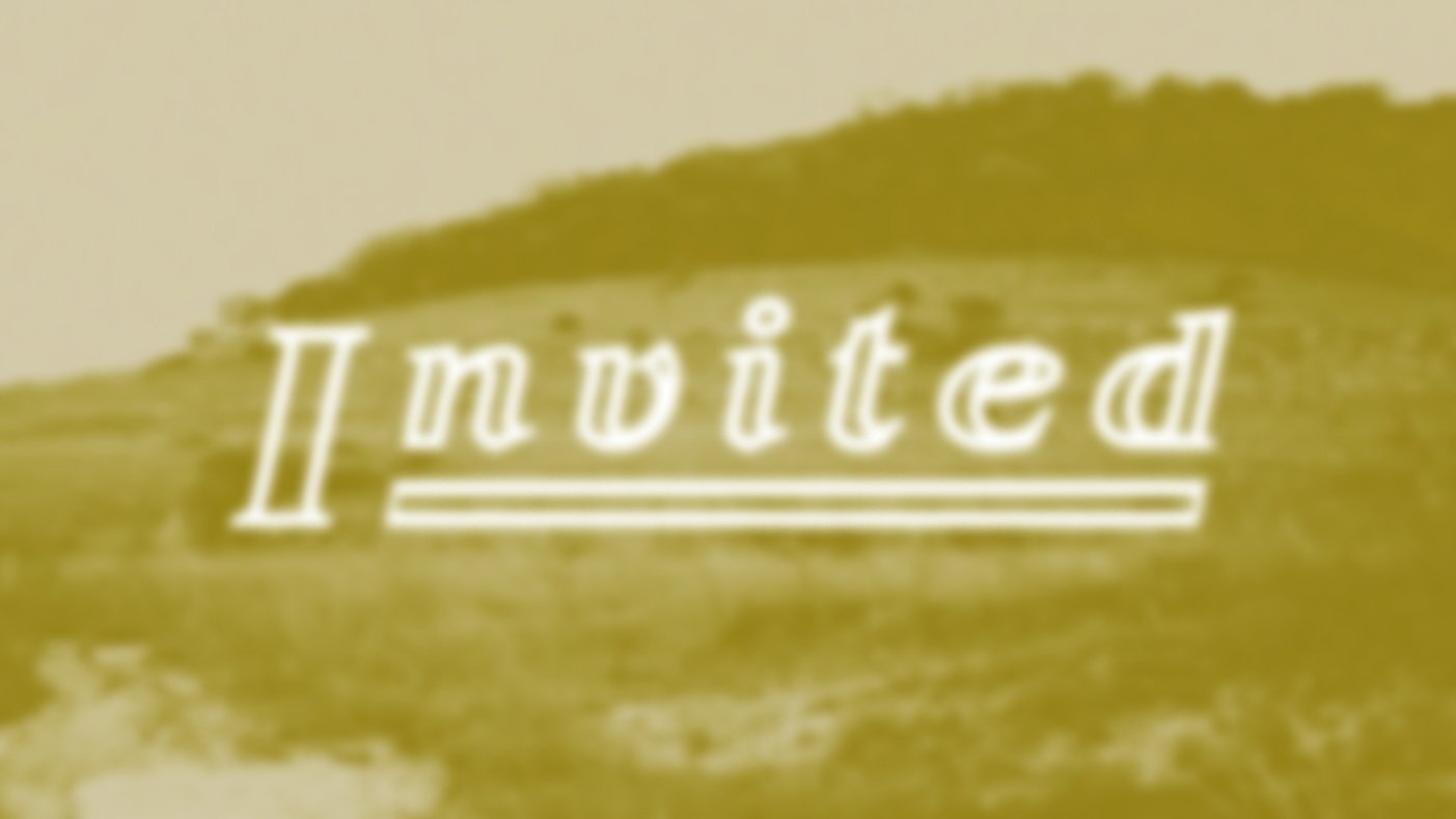
Above: Invited sermon series
‘Invited’ is a big deal. By it, what we partially mean is that we invite you into the promised land, if you will. Yes, this is the first Sermon series to kick off our move into a newly constructed church building.
My task was to create the sermon series title graphic.
After many drafts and much ideation, I chose to go a rather fair route, to avoid the risk of having a bad or unfinished project on the church’s hands for this expecting event. So my idea was to extend an invitation to the community, in the form of a postcard, to join us in the ‘promised land’ (metaphorically, and of course, post-Christ, this would require the right kind of hermeneutics and explanation, but it certainly fits). I had one of my best friends, Jacob Carroll, lend me his photos from a hike we took at a beautiful spot nearby—Balcones Canyonland. It’s more special to our community if we use subjects that are recognizable and relevant to us rather than stock images, which have been employed in HCBCL’s work more than often than a graphic designer can stomach!
Like the Explore graphic, the Sermon slide imagery are best understood as cool communication. They can’t be distracting to the audience. But it should be distinct and familiar, and be significant to invoking not only the concepts the pastor will go over, but the emotional sensibilities coupled with the propositions. I resonate with McLuhan’s words on faith necessitating a perceptual relationship to it, rather than conceptual:
“You don’t come into
the Church by ideas and concepts, and you cannot leave by mere disagreement. It has to be a loss of faith, a loss of participation.”
Below:
Quick deliverables for Hill Country Bible Church Leander
Being given work considered to be small doesn’t mean I can’t put a good amount of energy and thought into it. In fact, doing these small tasks
are a big deal to creating a kind of environmental resonance or ‘brand vibe‘.
-
![]()
Prayer Night slide
The prayer night graphic is also a cool, sublime image. I noticed that the render output on the new, massive LED screen interprets the image so sharply, that even a nice, beefy hi-res render will show some raster. So I’ve decided to make sure that I’m putting a slight blur effect on the image contours.
-
![]()
Mission to India 2023
A quick slide for the trip… no major requests for this design, but was given a few photos to potentially incorporate.
-
![]()
Explore HCBC Leander
This was a quick project, but one meant to aid the a critical portion of HCBCL’s Communication; the Explore seminar is a meeting for all those interested in becoming a member of our church. There, they’ll get a concise deep-dive all about our beliefs and culture. The graphic is on our website as a thumbnail and on Explore packet that you get during the seminar.
My strategy behind the image backdrop was to create something with a tactile, participatory nature to accommodate the also participatory form of the seminar, which is an education medium that seeks depth. When an image is lo-fi, it requires the viewer to participate in filling in the information gaps. The gloss texture (which comes from a photo I took of a leather chair, you can see this detail best on the zoomed-in sample that was chosen on the bottom right of this page), along with the grain effect, both superimposed onto this slightly blurred map of our city, was how I created a participatory, mosaic image.
Other than that, what was left was to pick a unique typeface to accommodate the Explore HCBCL concept. -
![]()
Explore HCBC concept render
Type was a bit too hard to read and the committee happened to prefer a darker render for the ground texture.
-
![]()
Split
Split was a quick Student Ministry series that was about discussing polar dichotomies such as depression and peace.
I had fun printing and destroying the analog design. It rests in a bowl filled with soapy water on our stove.
-
![]()
Advent
Advent was also a quick Student Ministry series. It was for Christmas of 2022. I wasn’t given much of a brief at all, so I picked the subject that would signify the main concept and percepts.