This Case Study includes:
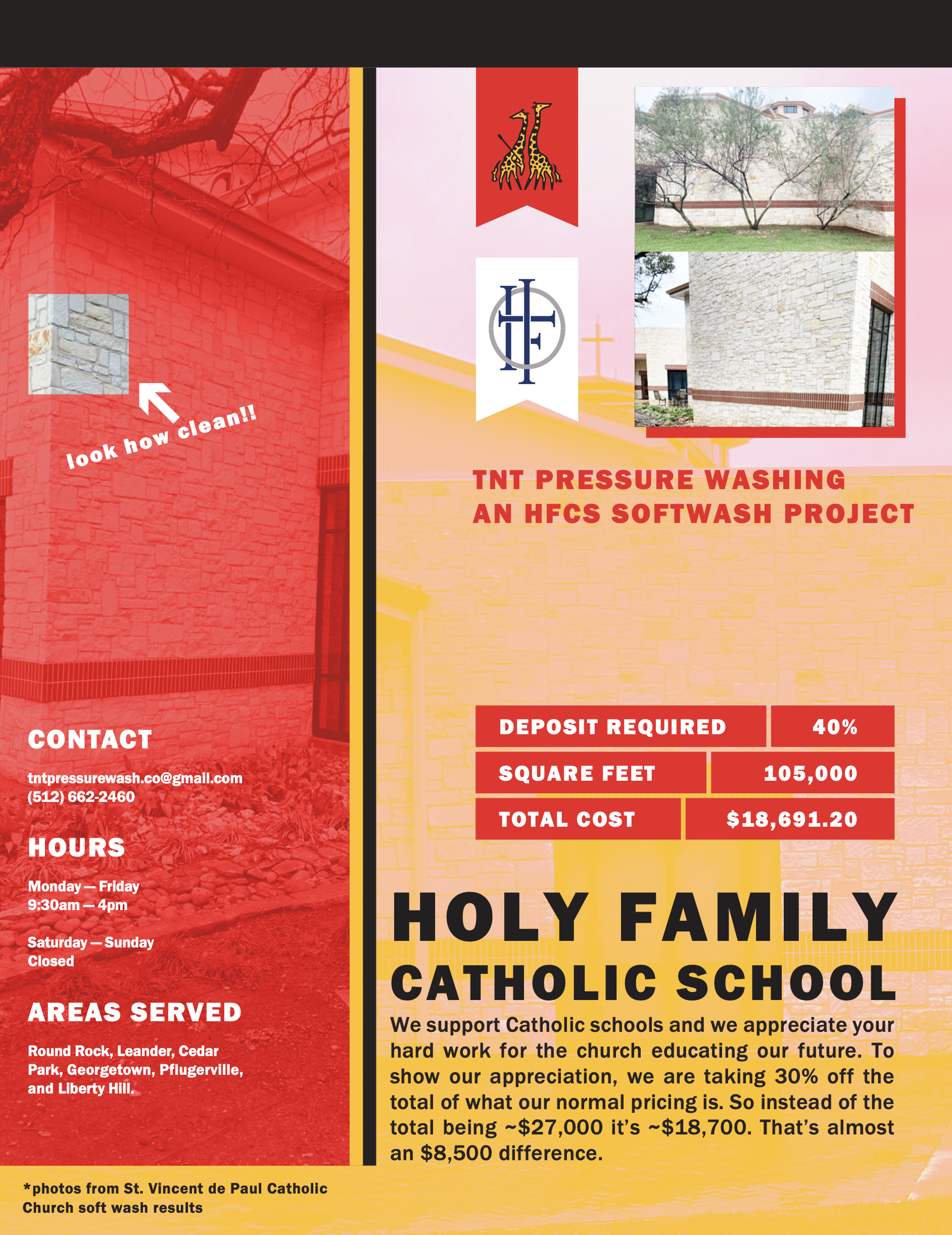
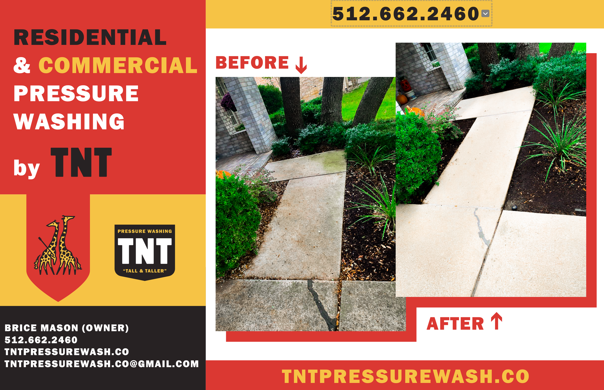
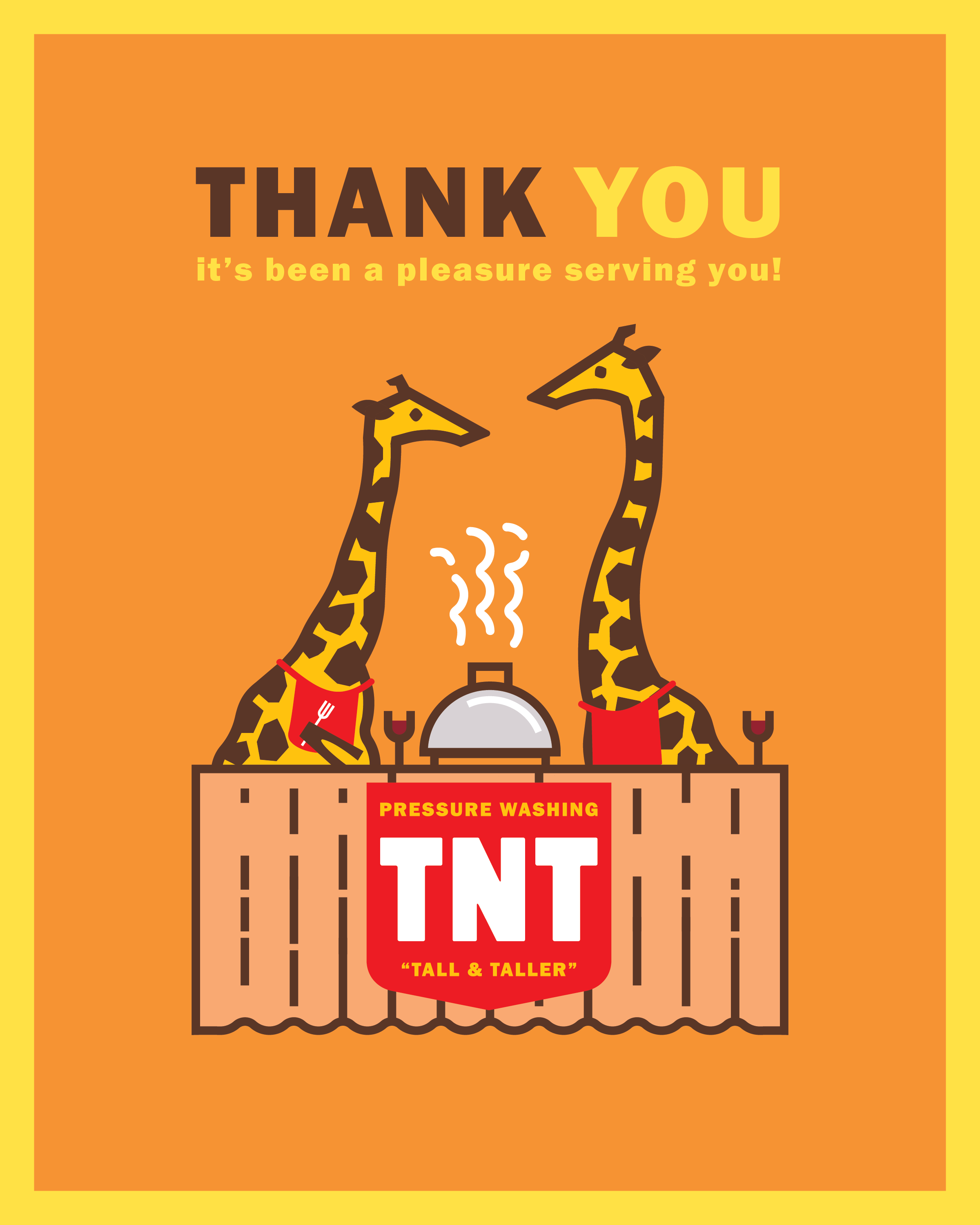
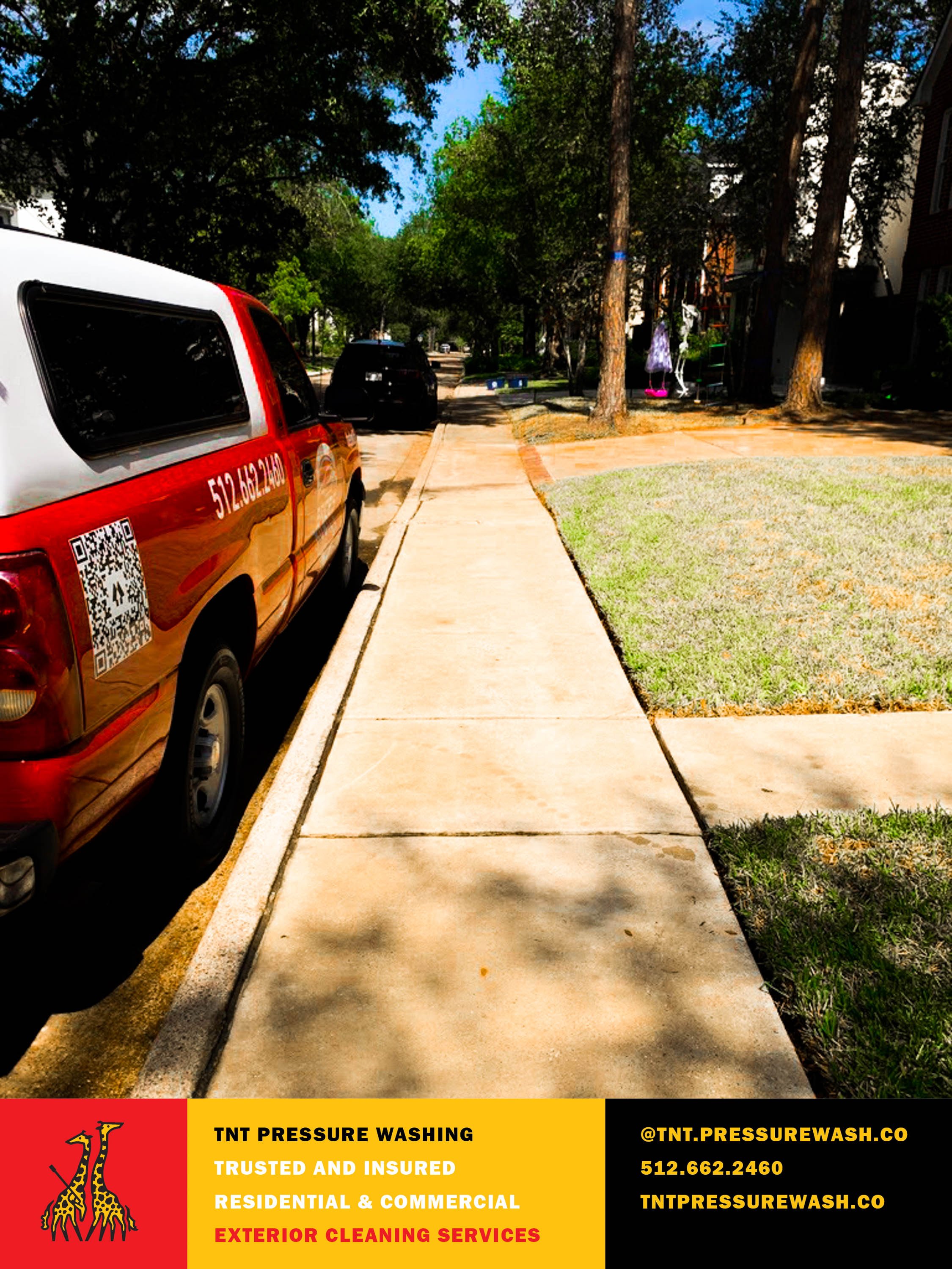
Logo Design, Visual Identity, Brand Collateral, Printed Material
TNT - “Tall & Taller” Pressure Washing
A simple, yet striking and well designed visual identity is versatile.
Whether for a branding project with a vast, multifaceted set of deliverables or for a quickie like this one, my goal is to set a client up for success by coupling strategy with great design. Here, the question was whether the amazing stewards of TNT were going to appeal to residential customers or to commercial. It was an essential question to answer—their tone of voice and character should be made to delight and appeal to their target base.
It challenged them to think just a bit more about their strategy. They chose the residence-types, meaning the identity could be more fun and appealing to homeowners. They have their home pressure washed for different reasons than commercial executives—it’s not an obligation to them, but simply a bit of refreshing novelty.
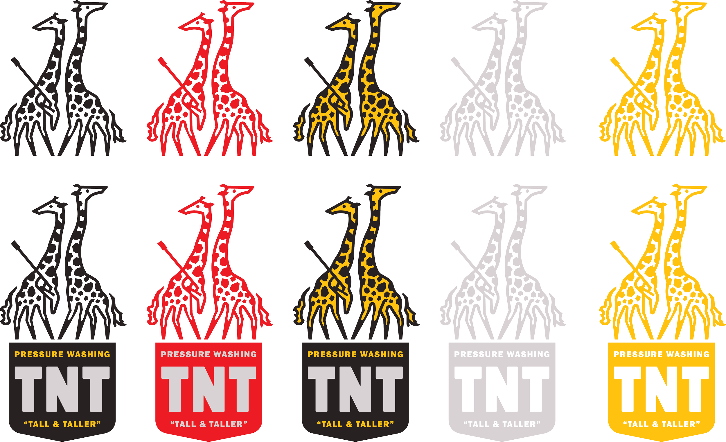
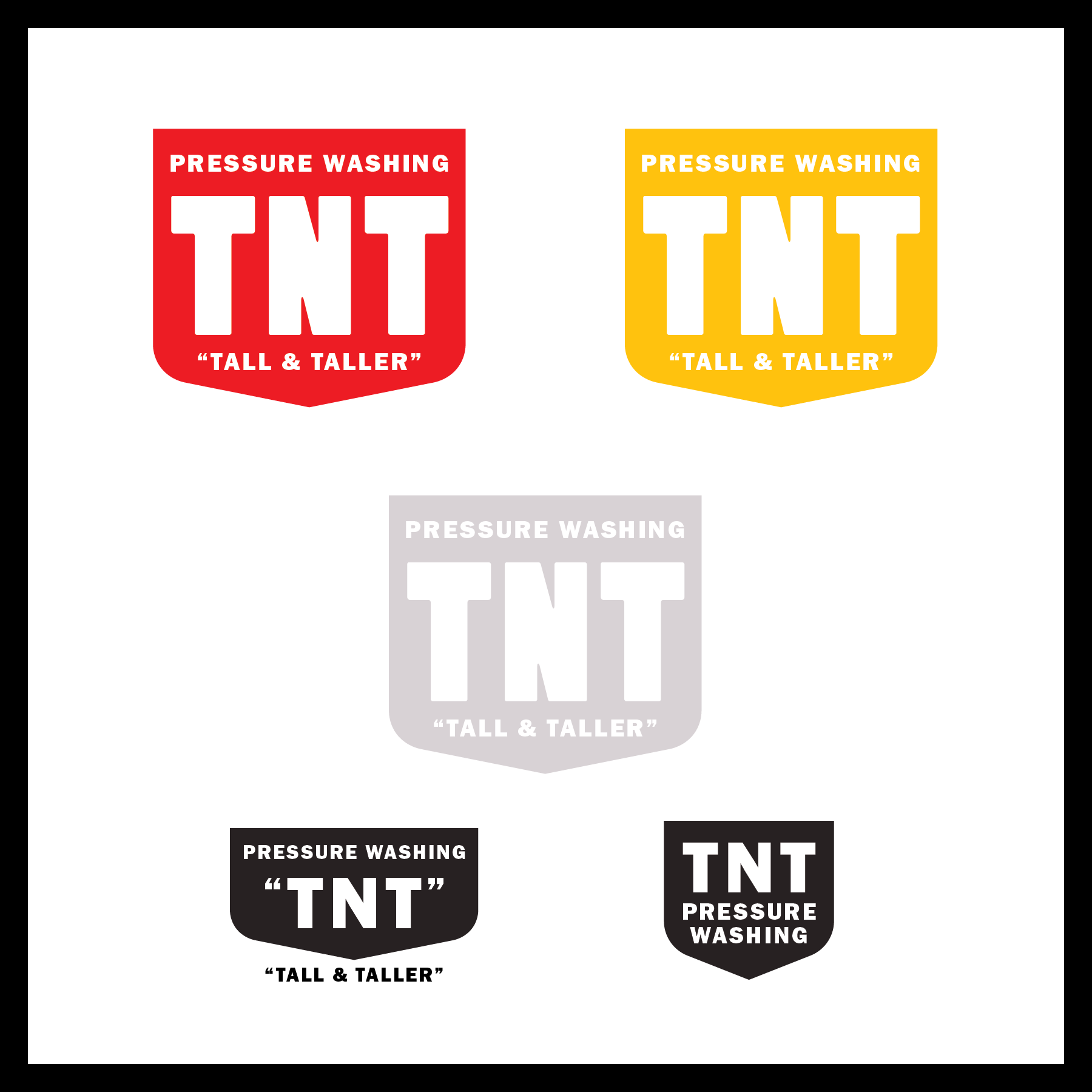
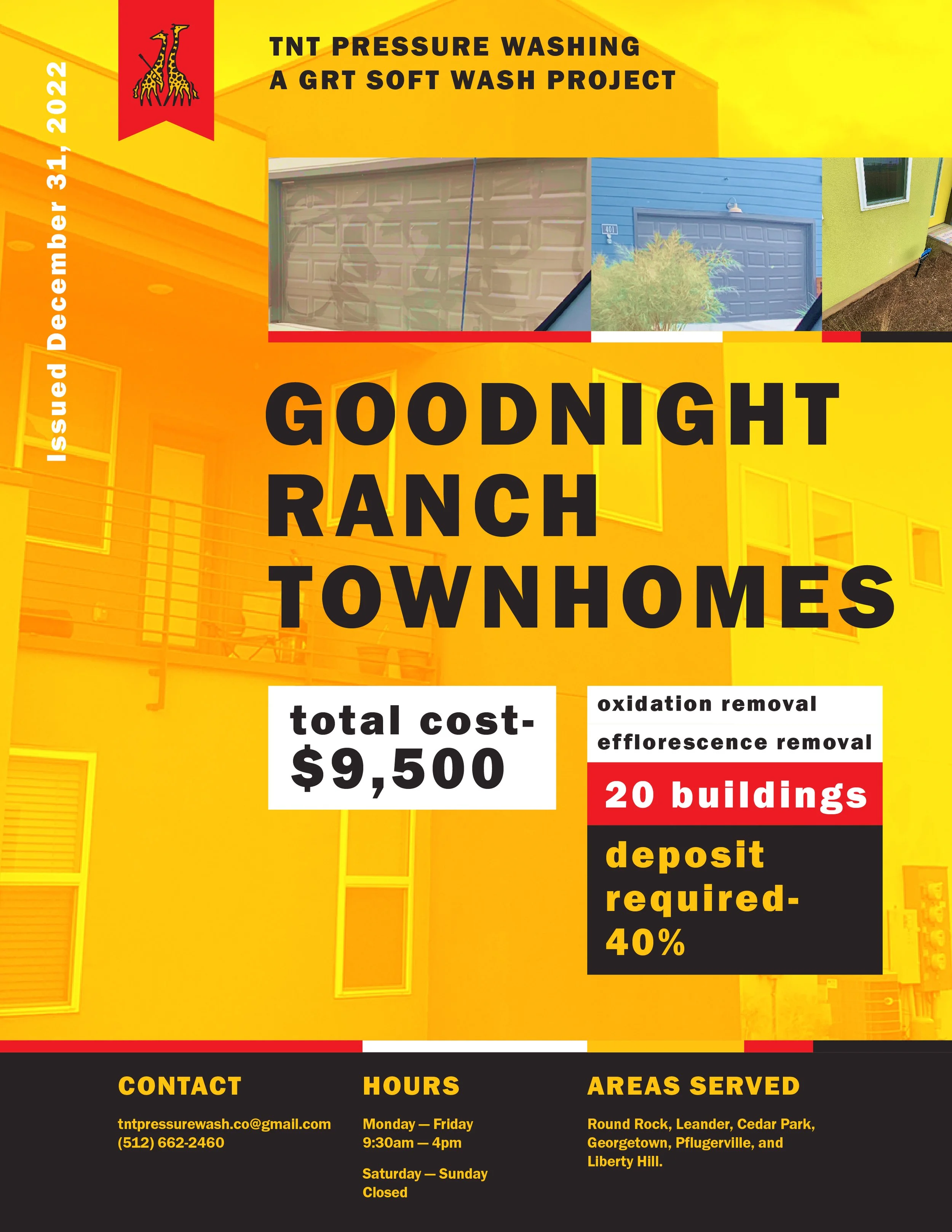
Their package included a logo, all the necessary logo files in different color combinations, including with or without the shield design. A business card was designed for them as well to pitch their services to potential homeowner clients. They received not just a logo, but a brand, so a brand guide PDF was delivered that states their color swatches and typography.
Additionally, an Adobe CC library was provided. The purpose of that decision was so that I can set my clients up for professional print and design success not only by providing the files but organizing the images in a way that will afford ease of implementation for whenever another designer might come around. This library of their graphic assets (with logos, colors, typography, brand guide, etc.) is accessible on all Adobe platforms.
The project did not include website design.
Need a nice driveway or house wash?
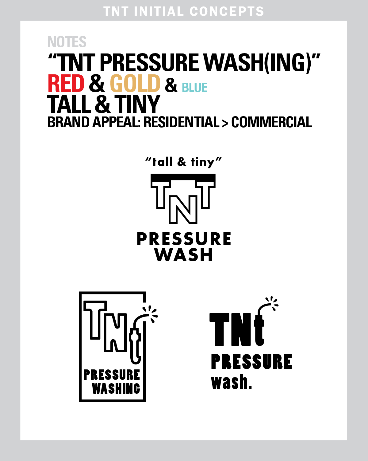
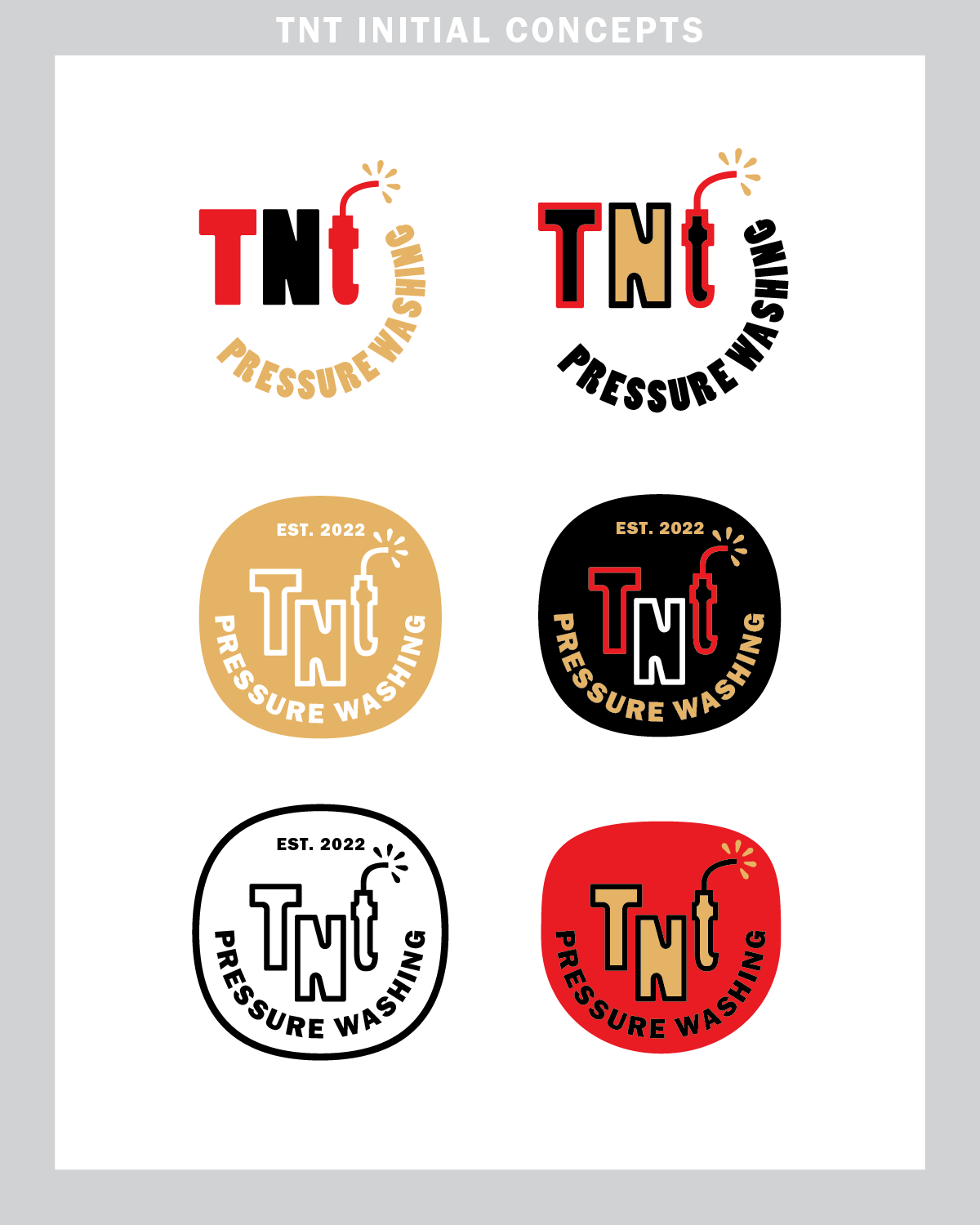
See the initial design concepts:
Final Product:
